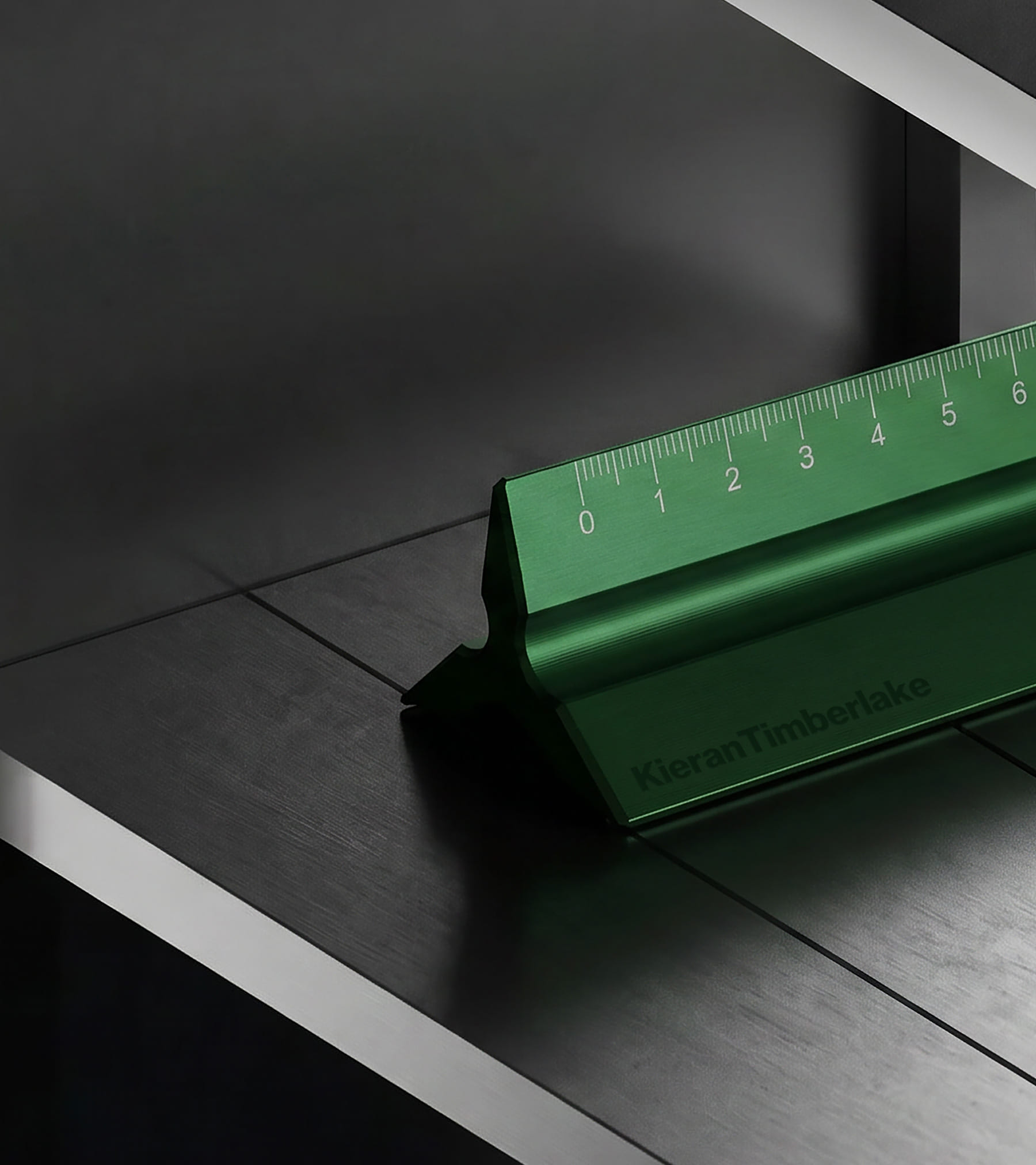
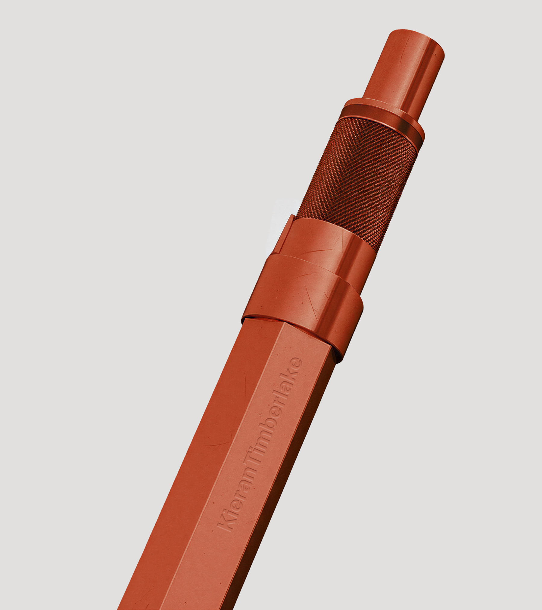
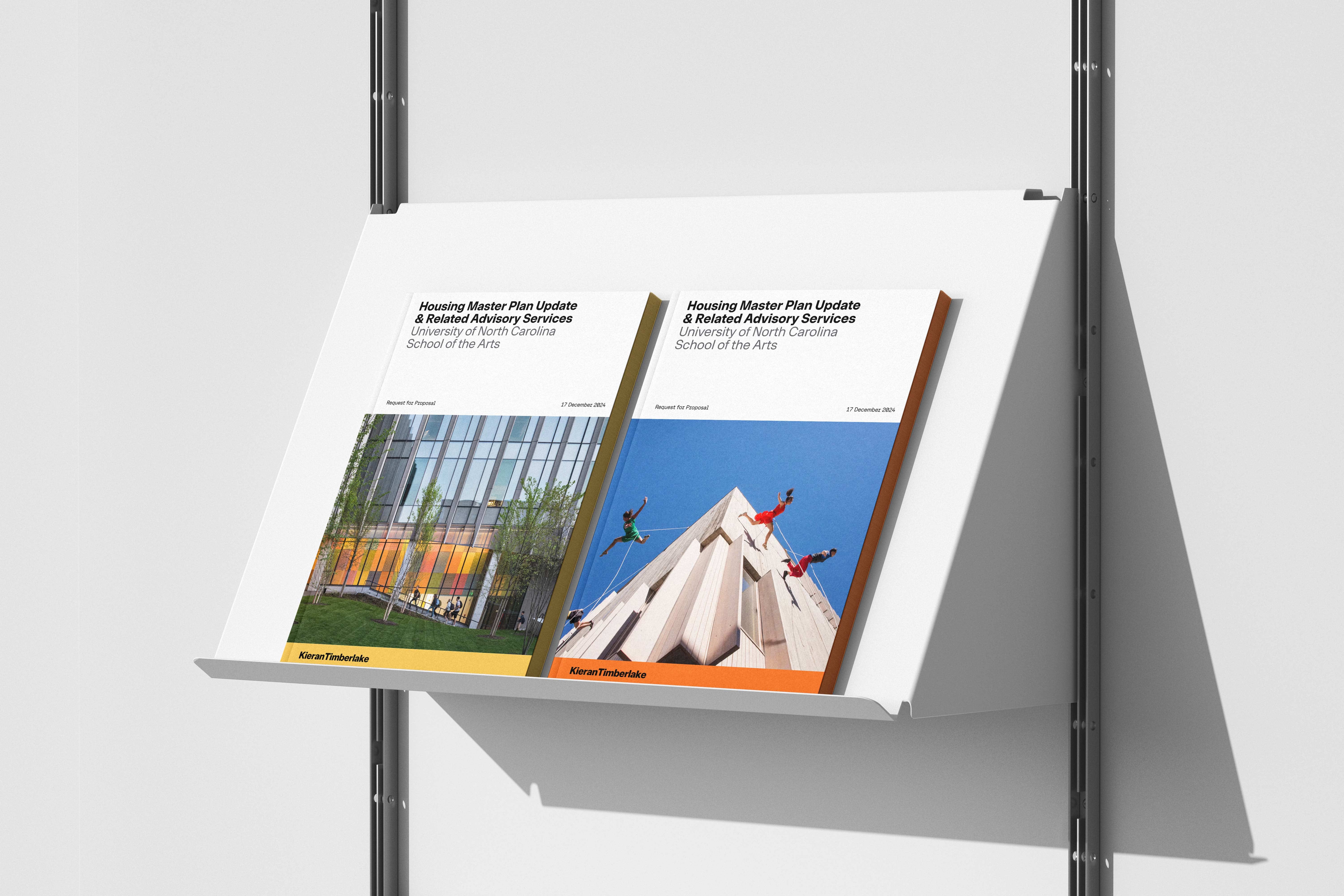
KieranTimberlake needed an identity that could compete on a more contemporary footing — one that signaled its enduring rigor while making space for the people and thought that animate the practice. The goal was to hold warmth and rigor in the same frame.
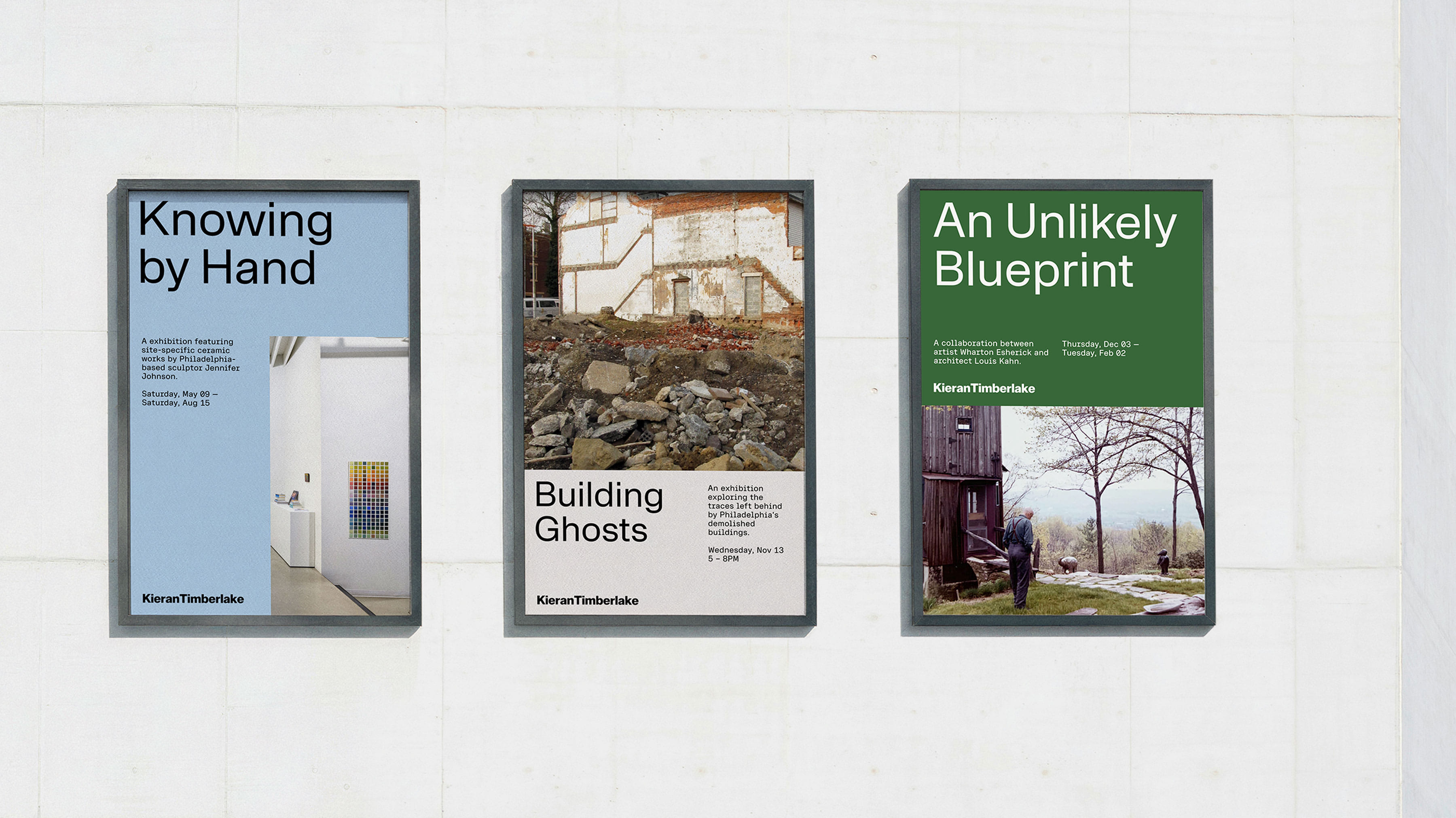
The visual system needed to move fluidly between the technical and the narrative, the documentary and the human. A sans and serif pairing, joined by a semi-mono typeface, gives the firm typographic range from spec-sheet precision to broader storytelling.
Design and research are inseparable at KieranTimberlake, and the site is built to reflect that. A sidebar runs alongside the main content, opening a dedicated channel for the firm's research practice — a place to dive deeper into the inquiry that shapes the work.
The work lander carries forty years of practice in a single view, functioning as both showcase and archive. Every project surfaces, whether it has a full case study behind it or not. A scaling interface lets visitors zoom in and out across the breadth of the firm.